Part 3: Bootstrap, Graphical Analysis, and Kurtosis
This post is the third in a series of posts based on chapters in my PhD thesis. The first one is here, the second one is here, and the fourth one is here.
In the previous post, I looked at how to tell if the parameter estimates from a statistical model are measuring the true signal or just noise, and usually this is done by taking more measurements. Since the added noise processes associated with many scientific measurements are effectively Gaussian, which has a distribution with a mean value of zero, as we sample more measurements and average the model parameter estimates obtained, we will hopefully converge to the true value of this parameter. Many MRI sequences allow for multiple measurements of each voxel, which are averaged to obtain a better estimate of the signal. This averaging process, however, leads to longer scan times, which, when dealing with real, live patients, come with a cost of increased likelihood of patient movement. Instead, during analysis we opt for shorter scan times, and then combine the results of multiple voxels from a patient and combine these as distributions. This also ensures we have adequate sampling across differences in the tissue, so that our results aren’t affected by sampling bias. This is also the reason that most studies involve combining these results across multiple patients, since each patient’s tissue may have different properties.
Point and Interval Estimates and Diagnosing Ill-Conditioning
As I discussed in the previous post on the biexponential model, combining all of these measurements as differences can mask whether the results of individual voxels are actually reliable. My thesis and several other papers have demonstrated considerable uncertainty in the parameter estimates returned from the biexponential model, but these studies usually involve computer simulations. While a computer simulation can demonstrate results under controlled circumstances, these results don’t have a direct correlation to real world data, because we don’t know what the true signal in these data should be. Because of the time constraints and the cost of real world data, each voxel will have one measurement taken at each b-value, possibly with some signal averaging to increase its accuracy. Fitting these measurements with the biexponential model then gives a point estimate, a single best estimate set of four model parameters for this particular tissue voxel. While we can then have a quality measurement from a given voxel with high SNR, the results from the biexponential simulations show that for certain signals which are effectively monoexponential, a high SNR measurement does not guarantee reliable parameter estimates. As the parameter histograms from my simulations in the previous post also showed, the distributions of these parameter estimates were decidedly not normal, and were widely dispersed with many outlier values. This is troubling because, even if we had parameter estimates from many fits of the same voxel, averaging multiple parameter estimates would not converge the result toward the true value. Thus, obtaining hundreds of results may lead us to believe that we are increasing our accuracy, but we may be averaging to a value that does not reflect reality. Given these model estimation issues, I was hoping to find a way for researchers to be able to determine whether the biexponential parameter estimates from a single voxel measurement are reliable or not. I also wanted a methods that allowed someone to go back to their existing data and gain more information about their previous results without acquiring more data.
So, instead of a single point estimate, what we would then like is to have an interval estimate of our model parameter values. This would give us an idea of what range of values would likely be seen for other noisy measurements of the same voxel. Given the possibility for extreme uncertainty in the parameter estimates, we would also like these interval estimates to reflect how reliable this measurement is likely to be. I discussed several measures that can assist in diagnosing model parameter uncertainty in my introductory post on NLLS regression. Many of these measures such as R2, RSS, and SER are all goodness-of-fit based measures and focus on how well the model fits the data. As noted above, however, how good the model fits the data does not provide insight into the reliability of the parameter estimates, so it’s worth restating in bold here: goodness-of-fit measures cannot diagnose ill-conditioning in the model fit. Thus, we proceed further in our regression fit diagnosis to measures based on the Jacobian. I list several diagnostic measures based on the Jacobian in section 2.1.3 of my thesis, such as covariance and correlation matrices, Variance Inflation Factors (VIF), the condition number, and estimated parameter standard errors that can then produce confidence intervals. These measures all work well when diagnosing linear regression fits. As I demonstrate and report on in Section 2.3.4 of my thesis, however, these measures all proved to be inadequate for many signals when using nonlinear regression in my simulations.
This makes sense in retrospect – if the Jacobian matrix is so ill-conditioned such that the parameter estimates are no longer reliable, it would follow that the diagnostic measures from this same matrix would also be unreliable. Diagnostic measures of collinearity were examined at length in the book Collinearity Diagnostics by David Belsley. In this book, Belsley analyzes the performance of these measures at length, and concludes near the end that the best measure of diagnosing ill-conditioning was what he terms a “perturbation analysis”. Put simply, perturbation analysis looks at the regression fitting process in the same way that ill-conditioning manifests itself – small changes to the input can lead to large changes in the output. We intuitively know how this perturbation process works in our lives, but we may not even think about it. The best example I can think of is putting up a ladder. When we get the ladder set in the position we want, although it may look nice and stable, our intuition is to wiggle it and perhaps stand on to the first step and shift our weight around. This makes sense, since the initial position may look good, but until we stand on it, we may not know whether the ground where we are standing is uneven or unstable. Thus, we “perturb” the ladder with small changes to make sure large changes don’t happen when we are further up the ladder, i.e. falling over. This is a good engineering practice to have, considering the number of injuries and fatalities that happen with ladders each year. (Update I probably subconsciously used this example from John D. Cook’s excellent blog, in particular this post. I have not yet read the book The Flaw of Averages by Sam Snyder, but it sounds like my kind of book.)
The Bootstrap
While reading various books and papers like Belsley’s, trying to understand and diagnose the ill-conditioning phenomenon in regression fitting, I was also reading and trying to tackle another statistical concept, the bootstrap. The bootstrap is a statistical resampling technique developed by Bradley Efron. Essentially, the bootstrap is used to examine the properties of a statistical estimate. For example, if we only have ten samples from a given population, we could calculate the mean and variance of this population. But ten samples is a very low sample size, and we’d really like to have a better estimate of the mean and variance of this population. What we can do then is randomly resample from the values we do have, repeating this thousands of times. This will give us a larger sample size and, hopefully, a more accurate value of the mean and variance of the actual population. This method of obtaining the standard error and/or confidence interval of an estimate is the most common use of the bootstrap.
This description of how the bootstrap sounds surprisingly like what I was looking for in my research – a way to determine an accurate interval estimate from a single point estimate of a parameter. What I focused on in my work was then the use of the parametric bootstrap, a way to determine the likely intervals for parameter estimates obtained from a regression fit. I implemented the parametric bootstrap in my nonlinear regression fitting as follows:
-
Obtain data measurements at different b-values for a given voxel (whether real or simulated), and fit this data with the desired model in a nonlinear least squares (NLLS) regression fit. For the biexponential model, the fitting algorithm returns a set of four parameter estimates.
-
Plug these parameter estimate values back into the model equation and calculate new (signal) amplitude values at each b-value. I will call this the parametric model data set.
-
Obtain the set of residuals returned by the NLLS algorithm for this same regression fit.
-
At each b-value data point, randomly obtain one sample from the set of residuals and add this value to each of the parametric model data points. This produces what I will call a bootstrapped (resampled) measurement.
-
Perform the same NLLS regression fit with the biexponential model on this bootstrapped measurement, obtaining a new set of parameter estimates.
-
Repeat this bootstrapped fitting process multiple times for a total of 1000 bootstrapped fits. This produces a population of 1000 parametric estimates for each of the four model parameters.
-
Examine each of the populations and calculate the standard error and/or confidence interval of each population.
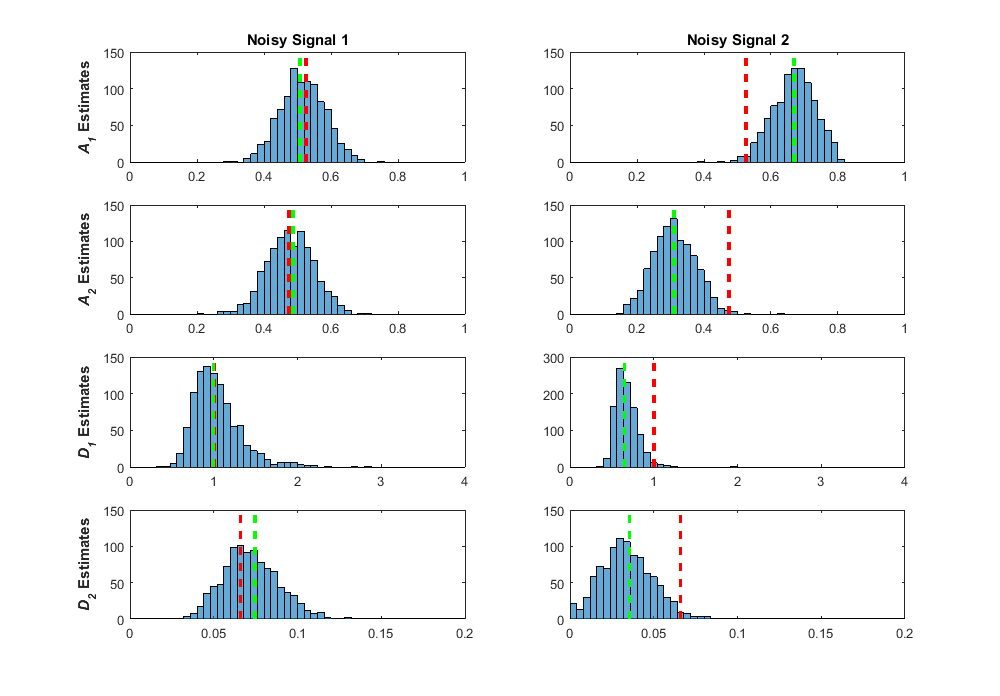
This is my best explanation of the process, but if you work better with computer code, reference my bootstrap NLLS fitting code here. This method worked really well for me, giving a method to obtain interval estimates from one single fit! Two caveats, however. One, obtaining these bootstrap samples requires considerable extra computation time, so a thousand bootstrap fits means a thousand-fold increase in computation time. This can be considerable when you are already analyzing thousands of voxels. Two, it’s worth reminding ourselves again that the bootstrap is a statistical method, and obtaining thousands of bootstrap samples does not magically produce the true value of a given estimate. This was best said by Stephen Senn, “The bootstrap is very useful but it cannot capture in the re-sampling what has not been captured in the sampling.” I can illustrate this with some results I obtained when using the bootstrap on my biexponential data simulations. The first image below is Figure 32 from my thesis. In it I show what the bootstrap sample distributions were for two separate fits of simulated noisy measurements of a true biexponential signal with A1 = 0.53, A2 = 0.48, D1 = 1.00, and D2 = 0.066 (true ratio of D1/D2 = 15). The true values are shown as the dashed red lines for each parameter, the green dashed lines are the parameter estimates for that fit of the noisy signal measurement, and the blue distributions are the results from fitting 1000 bootstrap samples. As you can see in the left column, I purposely selected the estimates from a noisy measurement fit where the estimated values were close to the true values. In this fit, the bootstrap distributions are centered around the estimate and thus, close to the true value. In the second fit (right column), I purposely chose a fit where the estimates deviated considerable from the true value. In this scenario, the bootstrap distributions are centered around the estimate, but the true value is found out on one of the tails of each distribution. Although these bootstrap distributions are offset from the true value, these distributions do, at least, encapsulate the true value, which is what we want from an interval estimate.
The above signal was from a true signal where we didn’t see a lot of the effects of ill-conditioning in the regression fitting process. The ratio of D1/D2 = 15 was in the area of lower bias and variance in the pseudocolor plot in my previous post. In these fits, even when the estimates are further from the true values, the true values are encapsulated in the tails, and the bootstrap distributions are well-formed and effectively normal. Let’s look at how the bootstrap distributions come out for a signal where the regression fits were severely affected by ill-conditioning with true values of A1 = 0.53, A2 = 0.48, D1 = 1.00, and D2 = 0.41 (true ratio of D1/D2 = 2.43).
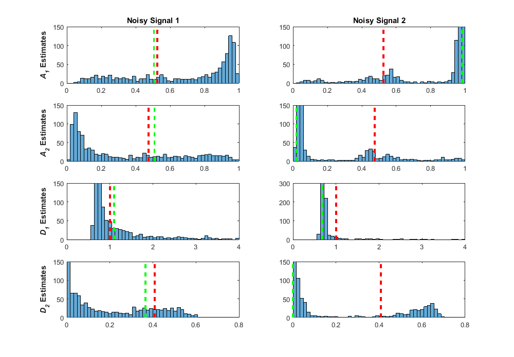
In the left column, I purposely chose a signal where the estimates were close to the true signal value, so in this case we would interpret that our fit was reliable. The bootstrap distributions tell a very different story, however, with widespread dispersion over the entire parameter space, and the majority of the distributions clustering in areas that are far from the true value. When choosing a signal where the estimates were far from the true value (right column), you can see that these estimates are found where the majority of the bootstrap samples are found. It is interesting to note that in both fits, the shapes of the bootstrap samples are very similar. These effects on the bootstrap distributions also look very similar to the estimate distributions found across the simulated data in my previous post. The interval estimates found from these bootstrap distributions contain nearly the entire possible parameter range, giving an indication that something is wrong here. After these experiments, I linked the good performance of the parametric bootstrap as a diagnostic measure of ill-conditioning back to Belsley’s perturbation analysis, because that’s what it is! For each regression fit, we use the residuals to add noise to the fitted signal, effectively perturbing or “wiggling” the data. For fitting with low ill-conditioning, these small perturbations produce small perturbations in the parameter estimates, with the bootstrap distributions looking like the distributions of the added noise, effectively normal. For fitting with high ill-conditioning, perturbing the data shows catastrophic results in the parameter estimates. When fitting data where the true values are unknown, we can use these distributions as a guide to whether these estimates are likely to be reliable.
Graphical Analysis of Ill-Conditioning
In Section 2.3.6 of my thesis, I demonstrate the results of a graphical analysis of the effects of ill-conditioning on NLLS regression fitting. I give a short intro on what I mean by a graphical analysis in my introductory post to Nonlinear Regression. In that post I show how a nonlinear regression algorithm finds the minimum value of the error (in the least squares case, RSS) by plotting the error vs. the two model parameters as a 3D surface plot. This allows you to see how well the model fits the data for various combinations of parameters. Later in that post, I show a 2D contour plot to demonstrate a zoomed in view that allows you to see what the likely margin of error in the parameters would be compared to the value of the RSS. As I also show in my post, the RSS can be related to the noise in the model by converting it to an SER (Standard Error of Regression). In the second contour plot there, you can see that for that particular model fit, the region around the best parameter estimates returned by the algorithm was elliptical. In this case, the estimated errors for each parameter are likely to have a symmetrical distribution.
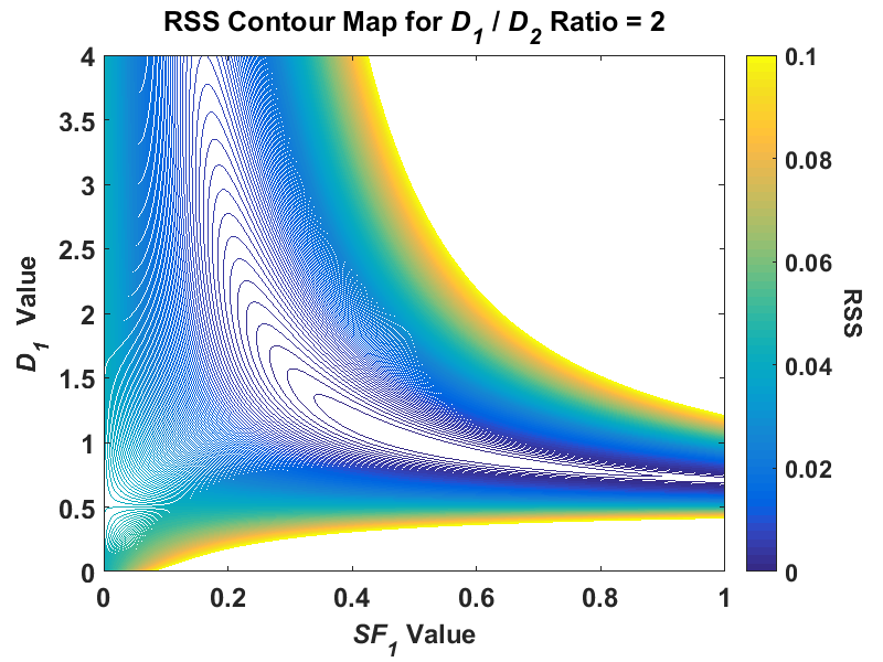
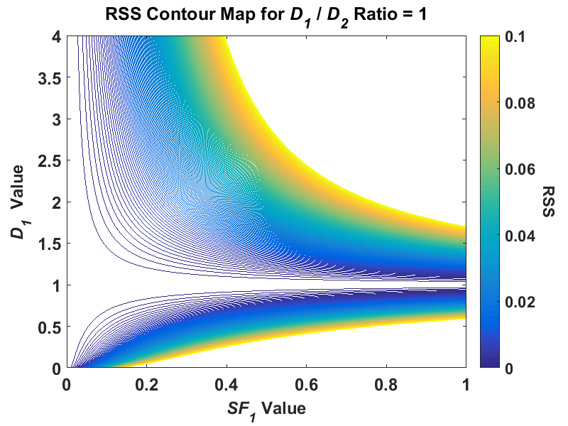
While researching regression fitting problems during the course of my PhD, I tended to get the impression from much of the literature that if my simulations were returning highly uncertain parameter estimates that are all over the place, I must not be using the right algorithm for the problem. In nonlinear regression, this is often related back to the algorithm not finding the global minimum. Thus, when performing my NLLS regression in my simulations, I often used multiple random starting points to ensure that the algorithm would indeed find the lowest minimum. I also examined some global search algorithms such as simulated annealing and genetic algorithms. After using all of these, I still found that my first NLLS regression fit had no problem finding the global minimum. It was only after perusing the book Nonlinear Regression by Seber and Wild, specifically Chapter 3 on sum-of-squares contours, did I see patterns that looked like the highly uncertain parameter estimates I was getting. I took the information from this chapter, and decided to plot the contours of a hypothetical biexponential model fit without adding any noise to the signal (the code that I used is available here). For the initial fit, I used simulated biexponential model parameters of SF1 = 0.5 and D1/D2 = 20, which would put the true signal in an area where my parameter estimates were relatively stable in my simulations. After creating a contour plot of RSS with SF1 for the x axis and D1 for the y axis, I got the following:
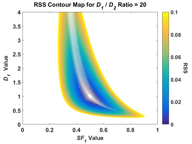
Note, this is a reduction of a four-dimensional model to two dimensions, and this plot was created using a fixed value for A0 and D2. While the shape of the contour was irregular at higher RSS values, around the minimum value of RSS, the contour is elliptical. I find this plot a useful conceptual tool if you think of this contour plot as a representation of a 3D “canyon” and the noise added to our problem as the “water level”. For reference, we can convert RSS to SER with the formula I used, SER = sqrt(RSS/(n - p)). In my problem, a simulated SNR value of 25 would then be equivalent to an RSS value of (n = 11 simulated b-values, p = 4 model parameters) around 0.011. As the noise is added to our simulated data, the SER value increases and so does its equivalent RSS value such that the water rises in the canyon. At a higher water level, the uncertainty in the parameter estimates increases because there is a wider area at the “surface of the water”, i.e. compare the area of the contour for 0.01 to, say, 0.08. Because this contour shape at higher “elevations” (RSS values), over repeated simulations of the same signal the combined parameter estimate distribution would start to skew. The major conceptual breakthrough I had was when I did the same contour plot for a signal where I had high uncertainty in my simulated parameter estimates where D1/D2 = 2. If I plot the same contour for this same signal at the same RSS scale, I get something radically different:
Where the lowest visible RSS contour was elliptical in the ratio-of-20 signal, in the ratio-of-2 signal, the contour is highly skewed and covers a much greater area, especially in the SF1 parameter. Thus, if we added the same level of noise to both signals, there is much greater uncertainty in the ratio-of-2 signal than the ratio-of-20. This proved to be a very useful tool in the visualization of the problem for a major reason – the creation of these contour plots did not use any fitting algorithm! You can see how the parameter estimates change with respect to the added noise when using any least squares algorithm. In my previous post I explained how fitting a true monoexponential signal with a biexponential model leads to an ill-posed problem because you are essentially attempting to solve an underdetermined problem, A1 + A2 = 1. When I created a contour plot of this D1/D2 = 1 signal I got the following:
You can now visualize the issue – the lowest contour isn’t even closed and covers all possible SF1 (and therefore A1 and A2) values. I also used this contour technique to see what would happen if I used the absolute value of the differences between model and data as opposed to the squared values. This reduces the error in the parameter estimates. However, using least absolute deviations leads to a whole other host of problems. This shouldn’t stop us from exploring this however, and maybe looking at some other techniques, such as regularization!
The Kurtosis Model
One last topic to end this post. In Chapter 3 of my PhD thesis, I examined another diffusion MRI model that has gained popularity in recent years, the kurtosis model. Kurtosis is actually another measure of explaining the shape of a probability distribution, and refers to how flat or peaked a distribution is. The first use of this model that I found was in a 2005 paper by Jensen et al. In that paper, the model equation used was:
S = S0exp(-bDapp + (1/6)b2Dapp2Kapp2)
This equation is similar to the monoexponential diffusion equation with the added second term in the exponential. Dapp is equivalent to the ADC in the monoexponential equation and Kapp represents the excess kurtosis, which is essentially a normalized kurtosis value such that zero is the kurtosis found in the normal distribution. Thus, in a diffusion MRI measurement, the kurtosis parameter attempts to estimate how the distribution changes in shape from a normal distribution, with a positive value of Kapp meaning a higher “peakedness” and a negative value meaning a more rounded distribution. You’ll recall that when we are measuring the diffusion of pure water, we actually have a Gaussian distribution, so plugging zero into the value of Kapp, the model equation reduces it to the monoexpoential model equation of S = S0exp(-bDapp). If we plot the signal with a positive kurtosis value, the exponential decay curve will not decay as fast. This would be what we expect if the diffusion is restricted, which is what usually happens when assessing data taken in human tissue, as discussed in previous posts. Thus, the kurtosis model adds a third parameter to the monoexponential ADC model to provide more information about the underlying process. The kurtosis model is offered as a competing model to the biexponential model and I listed a few papers in my PhD thesis (Section 3.1.2) where its performance is compared to the biexponential model. These studies demonstrate cases where the kurtosis actually performed better than the biexponential model when fitting data. Again, most of this performance is summarized in these studies using average parameter values and statistical tests. After investigating ill-conditioning, I noticed that the kurtosis model equation suffers a similar problem to the biexponential model. If the kurtosis model is called on to assess a monoexponential signal, such that Kapp = 0, then the second term in the exponential is redundant. I was curious as to see what the effect this would have on this model and its parameter estimates and wanted to compare it to the biexponential model. So, I used the same simulated biexponential data test set and fit it with the kurtosis model instead. The results from that are shown in the following image from my thesis (Figure 43):
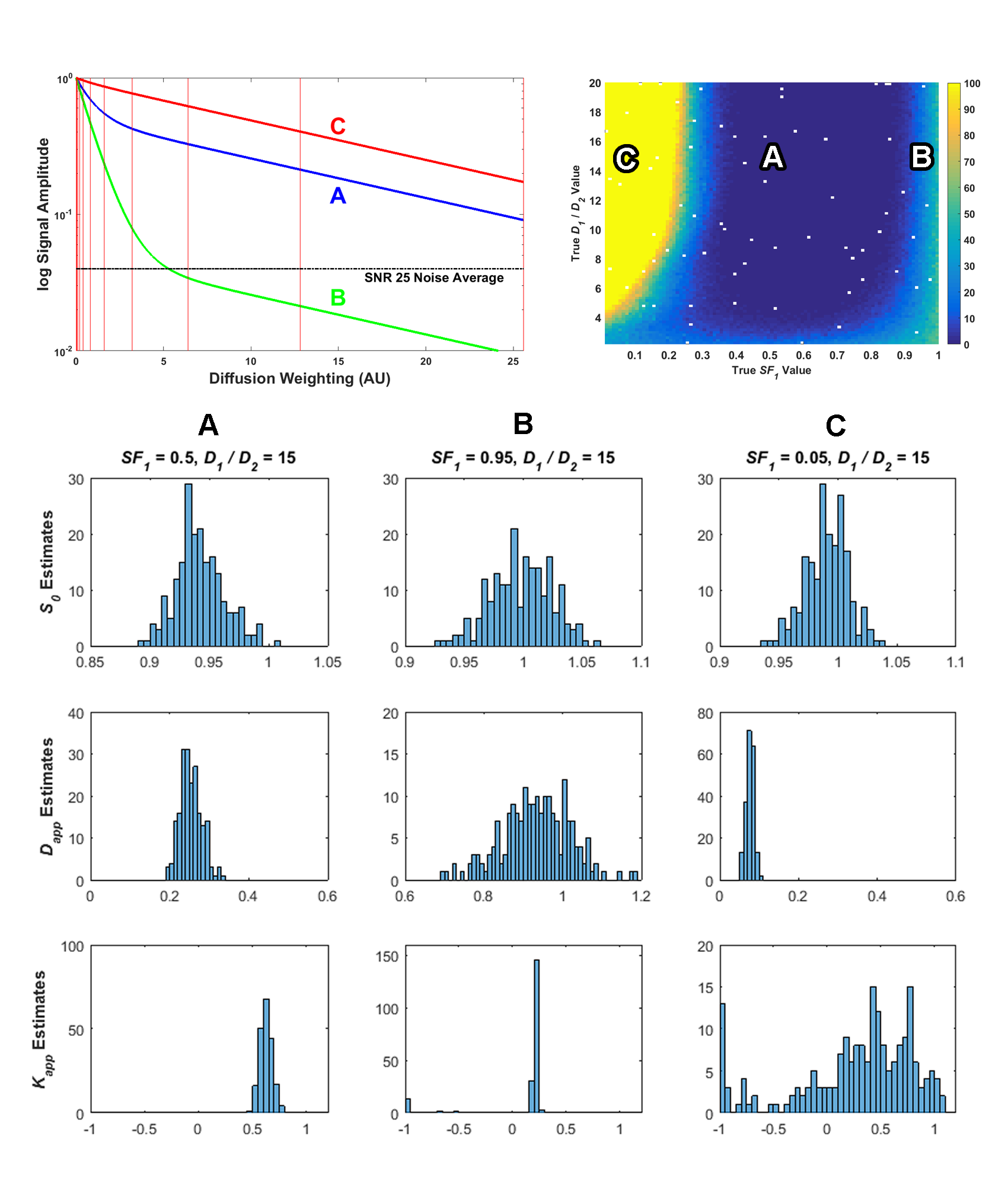
These plots, and the rest of the results in my thesis, show that the kurtosis does suffer from some of the same ill-conditioning issues that affect the biexponential model. My thesis discussion around this figure in Section 3.3.1 can provide more details, but the top left plot shows sample signals, the top right pseudocolor plot shows the number of measurements for each signal that had a condition number from the fit greater than 20, and the bottom histograms show a distribution of the parameter estimates. As the parameter estimate histograms show, compared to signal A, signals B and C have a higher uncertainty in the parameter estimates. The most interesting distribution is of the Kapp parameter estimates, especially for signal C, where the estimates were found widely dispersed over the possible range of values, with many values clumped at the lower range of -1. While negative values of kurtosis are theoretically possible, for this simulated biexponential data they should always be at least zero or higher. Thus, ill-conditioning does also affect this kurtosis model as well, and it should also be used with caution. I also show that the bootstrap can diagnose ill-conditioned parameter estimates on this model, too, and recommend its use in analysis. I also examine the kurtosis model on actual data in Chapter 5 of my thesis and compare its results with the biexponential model. Essentially, it also has real problems with actual data that is close to monoexponential and I display the effects.
Avoidance of Ill-Conditioning Problems
In Section 4.3.7 of my thesis, I examine the results of applying normality testing to the bootstrap distributions, and demonstrate that, on average, when the true signal is closer to monoexponential, the normality test will fail. Thus, using this bootstrap will, on average, tell you when the parameter estimates of a regression fit to a set of data are likely to have high uncertainty. However, we can look at my simulation results from a broader perspective and pose the following question. If the biexponential and kurtosis models seem to have problems only when the measured signal is effectively monoexponential, then why should we use them on monoexponential data? It seems to me that the monoexponential model is obviously the best model for monoexponential data, and it already a proven clinical standard, so how can we determine when we should use that model versus the others? This falls under the statistical practice of model selection and there are several methods that are used to attempt to answer this very question. In my next (and last) post on my PhD thesis, I will look at model selection methods and analyze just how reliable these methods are, again using simulated data. I come to the conclusion that there is also a lot of uncertainty affecting the model selection process, and that some of these selection measures may not be as “certain” as they are often made out to be.